What is Anamorphic art?
Anamorphosis is a form of perspective. It obeys all the laws of perspective, usually more strictly than any other form. It is, however, an extreme form of perspective in that an anamorphic picture is usually distorted in some way.
To remove the distortion and bring the image back to the way you normally expect to see it, you have to view it in a special way. This might be using a curved mirror or from a particular direction. Because you have to look in a particular way or from a special point, only one person can see it correctly at a time. So the artist is being very intimate with the viewer. These anamorphic images do not make sense unless you know how or where to place your eye. They are hidden until you look from the correct place.
Anamorphosis and Trompe L’oeil
Trompe L’oeil is often confused with anamorphic art because Trompe L’oeil literally means “to deceive the eye”. The deception is in the reality it portrays. A typical Trompe L’oeil painting is a still life which often depicts a notice board with letters and other objects stuck on it. When the painting is hung on a wall it looks like a real notice board. The deception is to trick you into thinking that it is real.Some anamorphic art adds deception by concealing the anamorphic image in an otherwise normal looking picture. This has nothing to do with Trompe L’oeil. There is no distortion in Trompe L’oeil, only illusion of reality.
What Anamorphosis is NOT
It is not stretchingPerspective does not stretch in the normal way. To understand this see the discussion of foreshortening in the description of perspective and the comparison of the quick and dirty methods of making anamorphoses and the true plane anamorphoses. However, you can get good approximations to anamorphoses using stretching.
Anamorphosis does not mean transform
Although an anamorphosis is a transformation, it is one of many types of visual transformation and not a synonym for it. It is often confused with the word metamorphosis which means transform in the sense of change of form.
Anamorphosis is not a visual illusion of size
There is a perspective illusion in which objects which can be measured as the same size appear to change size. This is a pure perspective illusion described in the posts on foreshortening and visual illusions.
Practical uses for anamorphosis
The intimate nature of anamorphosis which asks you to look from a particular point has two important daily practical uses. The Vignola method is used in advertising signs which have a rotating set of surfaces.Signs on the road to tell you to slow down, need to be both viewable by someone looking from a driving seat, and also only when they should see them. They are usually stretched images.
Looking at anamorphic art
Since each anamorphic image is special for you the viewer, each type has its own way to be looked at. The fun of anamorphic art is to LOOK rather than expect. Be surprised.It is not always possible to make the anamorphic images visible on a screen. Many of the images are available for downloading and printing.
Where to see anamorphosis
Visit the National Gallery in London to see Hans Holbein’s The Ambassadors and Perspective box by Samuel von Hoogstraten. Go next door to the National Portait Gallery to see William Scrots portrait of Edward VI.There is a lot of anamorphosis on the web. See the links page for examples.
References
M H Pirenne 1970, Optics Painting and Photography, Cambridge University PressAndrea Pozzo 1707, Perspective in Architecture and Painting. Reprint of English edition published by Dover 1989.
J L Hunt, B G Nickel and C Gigault, “Anamorphic Images”, American Journal of Physics, 68 , March 2000, p 232.
Martin Gardner “Anamorphic art”, Time Travel and Other Mathematical Bewilderments. New York: W.H. Freeman. 1988
John Sharp “Problems with Holbein’s Ambassadors and the anamorphosis of the skull.” Bridges: Mathematical Connections in Art, Music, and Science Conference Proceedings, R. Sarhangi, ed. (See www.Bridgesmathart.org)
Jearl Walker,. “Anamorphic pictures: Distorted views from which distortion can be removed”. Scientific American No 245 July 1981 p176.
Art of the grid, Ivars Peterson describes some anamorphic uses of the grid and then how the artist Doug Peden has used grids in his work.
Perspective
Perspective is culture dependent, and since the mid-fifteenth
century in the west it has been based on a very geometric system. The
method was invented, or rather rediscovered since the Greeks and Romans
knew how to draw in this way, by Fillipo Brunellesci around 1425. One of
the earliest artists to produce a book on how to draw in perspective
was Albrecht Dürer. As well as discussing geometric methods, he also
illustrated his book with a set of woodcuts showing practical tools for
accurate perspective drawing.
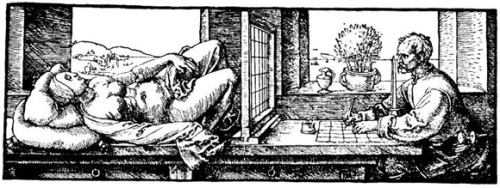
Painting a standard perspective picture is best thought of as looking through a window. Dürer’s woodcut shows an artist drawing a woman as if you were looking through such a window. It illustrates some important points about perspective and shows the grid method common to many methods of creating anamorphic images.
The artist has a grid on the window he is looking through. He also has a grid on the paper to use as a reference for what he sees in the window. This is like using graph paper and is a common method artists use when copying paintings too. Notice also that his eye is in front of a vertical pointer. He uses this to ensure he always looks from the same place and so sees the objects he is drawing in the same position on the grid.
Although Dürer’s artist is looking through a flat window, with the window placed so that if he looks from the pointer to the middle of the window, the light ray to his eye is perpendicular to the window. The grid on the window then looks like the grid on the table. If he moved the pointer to one side, then the two grids would no longer correspond. The grid on the window would no longer look regular and he would have to use a similar irregular grid on the table. He could still use the two grids as reference between points on his drawing and points on the objects he is drawing.
Anyone looking at the picture would have to look from this new viewing point at the side in order to see it correctly. If they looked at it centrally it would look distorted. This would then be an anamorphic painting since it could only be viewed without distortion from that point.
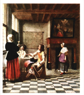
In this painting notice how the distance between the front and back of the tiles in each row gets narrower the farther away from you they are. This is known as foreshortening. Knowing how to construct this spacing correctly is the key to creating a perspective drawing or painting and is described below.
In most pictures, vertical lines are drawn parallel, because most objects we look at do not show vertical convergence. The exception to this is when you look at tall buildings. The following drawing shows a horizon line (red) with a number of vanishing points. Vanishing points P and Q are for lines which are parallel to the ground plane. These points are thus on the horizon line.

Parallel lines on the roof gable meet at point R. Because these lines are not on a plane parallel to the ground, point R is not on the horizon line. Line RQ is a vanishing line for planes parallel to the ends of the house. Can you find another vanishing point which is not on the horizon line, but which is on PQ?
“Here some would draw a transverse line parallel to the base line of the quadrangle. The distance which is now between the two lines they would divide into three parts and, moving away a distance equal to two of them, add on another line. They would add to this one another and yet another, always measuring in the same way so that the space divided in thirds which was between the first and second always advances the space a determined amount. Thus continuing, the spaces would always be – as the mathematicians say-superbipardenti to the following spaces. I can say those who would do thus, even though they follow the good way of painting in other things, would err. Because if the first line is placed by chance, even though the others follow logically, one can never know where the point of the visual pyramid lies.”
The word superbipardenti means exceeding by two parts. The method above shows that artists knew by looking that the spacing of a grid gets smaller as the lines of the grid get farther away from you. This is known as foreshortening and you can see this in the de Hoogh painting above. This discovery was a breakthrough in the understanding of the geometry of foreshortening.
One thing artists did understand, before Brunellesci and Alberti came on the scene, was that if the grid was laid parallel to the edge of the picture, then the sides of the grid going away from you were straight lines and met at a point in the distance. This point is called a vanishing point and is described later. Before constructing a correct foreshortened grid, let’s look at the incorrect one these early artists used.

The diagonals on a square grid all lie in a straight line:

Tthey can be used as test of whether the artist has used perspective. If the artist uses the 2/3 method Alberti describes then the diagonals form a curved line as shown at the right whereas they should remain straight:
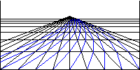
Step 1 – draw a border/frame with the proportions you want.

Step 2 – draw a horizon line (the red line) parallel to the base of the picture which is level with your eye if you were standing in front of the picture as a window.
Step 3 - along the bottom of the picture mark off equal distances which will represent the edges of the squares. Extend the base of the picture to get more lines and a bigger grid.
Step 4 – mark a point on the horizon, called the central vanishing point, and to it join each of the points you marked. This will give you a picture like the one above.

Step 5 – choose a point R on the horizon line, which is in proportion how far your eye is away from the picture. Point R is called the right diagonal vanishing point. For why this is so, see “How to look at a picture without seeing distortion”.
Step 6 - join point R to each of the points you marked on the base of the picture as shown by the blue lines above.
Grid

Step 7 - where each of the blue lines intersect the lines going to the central vanishing point, draw a line parallel to the horizon line. Note how all of the intersections are on these lines.

Step 8 – now get rid of the blue lines and the part of the horizon lines outside of the picture.

Step 9 - now erase the parts of the lines going to the central vanishing point which are beyond the farthest grid line and you have a set squares in perspective going into the distance.
Place your eye in front of the central vanishing point (C) at a distance CV away from the picture. You should see the same result each time. You can find out more about why this is the case in How to look at a picture without seeing distortion. What is the relationship of the spacing of the lines? This is a topic in itself , described in The spacing of lines in a perspective grid.

One way to construct the spacing is shown in the diagram above. We want to construct the position of D when we know the position of A and B.
1. Draw any lines CF and CH from C.
2. Draw any line AG from A to intersect CH at H and CF at G.
3. Join BG to give a line and similarly BH.
4. Extend BH to intersect CF at F and intersect CH and BG at J.
5. Join F J and produce it to intersect CA at D which is the required point.
The ratio (AB.CD)/ BD.AC) = -1.
The value is always -1. The values of AB, CD, BD and AC are measured according to their direction, so that if AB is considered positive then CD is negative.
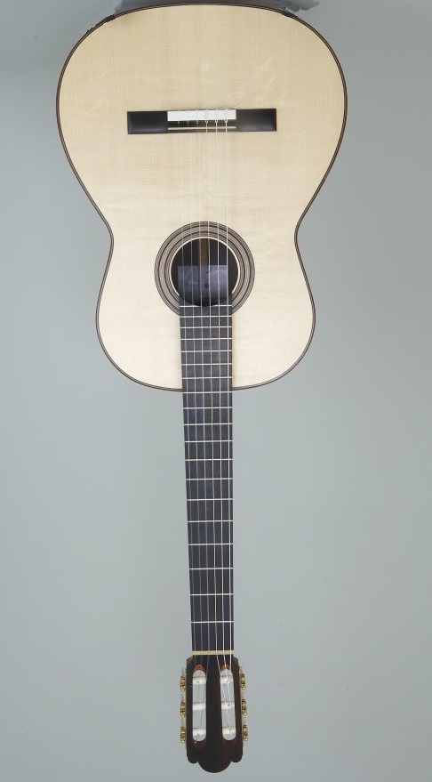
Another instance of the same spacing is the frets on a guitar:

Painting a standard perspective picture is best thought of as looking through a window. Dürer’s woodcut shows an artist drawing a woman as if you were looking through such a window. It illustrates some important points about perspective and shows the grid method common to many methods of creating anamorphic images.
The artist has a grid on the window he is looking through. He also has a grid on the paper to use as a reference for what he sees in the window. This is like using graph paper and is a common method artists use when copying paintings too. Notice also that his eye is in front of a vertical pointer. He uses this to ensure he always looks from the same place and so sees the objects he is drawing in the same position on the grid.
An experiment to try
You can see why he needs to do this with the following experiment. Close one eye and hold up a finger in front of your face about a foot away, and note what the finger points to. Close that eye and open the other one and you can see that the finger points to a different place.Projection and section
Light rays travel in straight lines, so the act of looking is to construct a set of lines from the tip of the pointer to each point on an object and where the line intersects the window is the corresponding point on the drawing. Only if you look at the artist’s picture from the same relative position, will you see it the way he saw it. If you look from anywhere else, it will be distorted. So it is important to realise that when viewing a perspective picture created in this way, you can only truly look at it with one eye if you want to see it as the artist did.Although Dürer’s artist is looking through a flat window, with the window placed so that if he looks from the pointer to the middle of the window, the light ray to his eye is perpendicular to the window. The grid on the window then looks like the grid on the table. If he moved the pointer to one side, then the two grids would no longer correspond. The grid on the window would no longer look regular and he would have to use a similar irregular grid on the table. He could still use the two grids as reference between points on his drawing and points on the objects he is drawing.
Anyone looking at the picture would have to look from this new viewing point at the side in order to see it correctly. If they looked at it centrally it would look distorted. This would then be an anamorphic painting since it could only be viewed without distortion from that point.
Foreshortening
One of the reasons that grids appear so often in perspective and anamorphic pictures is that they were one of the first objects it was easy to draw in perspective. They were the used in pictures to depict a tiled or paved floor. Look at pictures dating from 1450 to see how many such floors you can find. This also happened when there was a revival of perspective in Dutch art which coincided with the rise of the technology of optics in the 17th Century (look at paintings by Johannes Vermeer and Pieter de Hoogh). This is a typical interior by de Hoogh.
In this painting notice how the distance between the front and back of the tiles in each row gets narrower the farther away from you they are. This is known as foreshortening. Knowing how to construct this spacing correctly is the key to creating a perspective drawing or painting and is described below.
Vanishing points
The other vital detail you need to understand is that any two lines that are parallel in space meet at a point in the picture called a vanishing point. Furthermore, the vanishing points for sets of lines that are in a plane (or a plane parallel to a particular plane) meet in a line called a vanishing line. If the lines are parallel to the ground, then they meet on a special line called the horizon line.In most pictures, vertical lines are drawn parallel, because most objects we look at do not show vertical convergence. The exception to this is when you look at tall buildings. The following drawing shows a horizon line (red) with a number of vanishing points. Vanishing points P and Q are for lines which are parallel to the ground plane. These points are thus on the horizon line.

Parallel lines on the roof gable meet at point R. Because these lines are not on a plane parallel to the ground, point R is not on the horizon line. Line RQ is a vanishing line for planes parallel to the ends of the house. Can you find another vanishing point which is not on the horizon line, but which is on PQ?
Constructing a “one-point” perspective
The first book on perspective was Leon Battista Alberti’s Della Pittura or On Painting which described the results of the architect Brunellesci who is credited with the discovery of perspective around 1425. Before describing how to correctly draw the spacing of a grid in perspective Alberti says that some artists had a logical method which does not work:“Here some would draw a transverse line parallel to the base line of the quadrangle. The distance which is now between the two lines they would divide into three parts and, moving away a distance equal to two of them, add on another line. They would add to this one another and yet another, always measuring in the same way so that the space divided in thirds which was between the first and second always advances the space a determined amount. Thus continuing, the spaces would always be – as the mathematicians say-superbipardenti to the following spaces. I can say those who would do thus, even though they follow the good way of painting in other things, would err. Because if the first line is placed by chance, even though the others follow logically, one can never know where the point of the visual pyramid lies.”
The word superbipardenti means exceeding by two parts. The method above shows that artists knew by looking that the spacing of a grid gets smaller as the lines of the grid get farther away from you. This is known as foreshortening and you can see this in the de Hoogh painting above. This discovery was a breakthrough in the understanding of the geometry of foreshortening.
One thing artists did understand, before Brunellesci and Alberti came on the scene, was that if the grid was laid parallel to the edge of the picture, then the sides of the grid going away from you were straight lines and met at a point in the distance. This point is called a vanishing point and is described later. Before constructing a correct foreshortened grid, let’s look at the incorrect one these early artists used.

The diagonals on a square grid all lie in a straight line:

Tthey can be used as test of whether the artist has used perspective. If the artist uses the 2/3 method Alberti describes then the diagonals form a curved line as shown at the right whereas they should remain straight:

How to draw a grid in perspective
This method will produce a view of a square grid known as a one-point perspective which is commonly found in perspective pictures, particularly 15th century ones and Pieter de Hoogh paintings including the one above. The grid (usually in the form of a tiled floor) is placed so that one side of the square tile is parallel to the base of the picture.Step 1 – draw a border/frame with the proportions you want.

Step 2 – draw a horizon line (the red line) parallel to the base of the picture which is level with your eye if you were standing in front of the picture as a window.
Step 3 - along the bottom of the picture mark off equal distances which will represent the edges of the squares. Extend the base of the picture to get more lines and a bigger grid.
Step 4 – mark a point on the horizon, called the central vanishing point, and to it join each of the points you marked. This will give you a picture like the one above.

Step 5 – choose a point R on the horizon line, which is in proportion how far your eye is away from the picture. Point R is called the right diagonal vanishing point. For why this is so, see “How to look at a picture without seeing distortion”.
Step 6 - join point R to each of the points you marked on the base of the picture as shown by the blue lines above.
Grid

Step 7 - where each of the blue lines intersect the lines going to the central vanishing point, draw a line parallel to the horizon line. Note how all of the intersections are on these lines.

Step 8 – now get rid of the blue lines and the part of the horizon lines outside of the picture.

Step 9 - now erase the parts of the lines going to the central vanishing point which are beyond the farthest grid line and you have a set squares in perspective going into the distance.
Investigation
Draw a series of perspective grids which have the same spacing of the points across the bottom of the picture, but the diagonal point R at different distances. What happens to the appearance of the grid?Place your eye in front of the central vanishing point (C) at a distance CV away from the picture. You should see the same result each time. You can find out more about why this is the case in How to look at a picture without seeing distortion. What is the relationship of the spacing of the lines? This is a topic in itself , described in The spacing of lines in a perspective grid.
What does all this have to do with anamorphic art?
Anamorphic art is a form of perspective. The above discussion is about drawing on a flat picture plane that is perpendicular to the artist’s line of sight. In anamorphic art, the artist views the picture plane at an angle. This is not quite the same as foreshortening giving rise to visual illusions.The spacing of lines in a perspective grid
In drawing a perspective picture, we found out how to space the lines correctly, but what is the mathematical relationship? The early artists who used a ratio of 2/3 were partly correct. They knew each spacing depended on the previous one and there was a ratio involved. The ratio is a special ratio which is called a cross ratio. Cross ratio is a ratio of a ratio. Moreover in a perspective picture it is always a ratio which depends on the vanishing point of a line.
One way to construct the spacing is shown in the diagram above. We want to construct the position of D when we know the position of A and B.
1. Draw any lines CF and CH from C.
2. Draw any line AG from A to intersect CH at H and CF at G.
3. Join BG to give a line and similarly BH.
4. Extend BH to intersect CF at F and intersect CH and BG at J.
5. Join F J and produce it to intersect CA at D which is the required point.
The ratio (AB.CD)/ BD.AC) = -1.
The value is always -1. The values of AB, CD, BD and AC are measured according to their direction, so that if AB is considered positive then CD is negative.
Another instance of the same spacing is the frets on a guitar:

.
It is possible to work out where the artist’s viewpoint would have been, given certain assumptions that can usually be made. If you look in this way then the perspective picture becomes distortion free. Stray from this point and parts of the picture become distorted. Artists have ways of compensating for this in pictures and this is discussed in the section “So how do artists paint spheres” below.
The easiest type of painting to work with, is one which has a set of square tiles or other such objects which are on a flat plane such as the ground. This painting of The Annunciation by the Italian Carlo Crivelli which dates from 1486 is a typical example.

The actual painting is 2070 mm high by 1465 mm across. The base of the picture is displayed 1060 mm off the floor. To find the viewing point on the actual painting, we need to work with a reproduction and then scale it up to the size of the actual painting.
The steps to find the artist’s viewing position are:
1. Draw in some lines of the painting which are parallel (in the space of the painting) to a line perpendicular to the viewer. These are the yellow lines.
2. Intersect these lines at the central vanishing point.
3. Draw a horizon line (red) through this line.
4. Draw a line (blue) which is the diagonal of a square and intersect the horizon line in the right diagonal vanishing point.
5. Measure the distance from the central vanishing point to the right diagonal vanishing point.
Since the central vanishing point is directly in front of the artist’s eye, we need to place our eye directly in front of the grid behind the archway. Now we need to find out how far away we need to be. This is the distance from the central vanishing point to the right diagonal vanishing point as measured in step 5. Why this is so is described below.
Using proportion on a measurement on the lines drawn and the actual size of the painting, then the result is that we need to be about 120 cm away from a picture at a height of about 200 cm above the floor the way the picture is hung.
Now an average person’s eyes are about 160 cm above the ground. This means that if you want to get the true or best view of the painting, you need to do so standing on a box 40 cm high (about 16 inches). Moreover, if you try to look at parts of the painting, like the peacock at the top right, it looks distorted.
Why not see if you can find some perspective pictures in a gallery. Buy a postcard and work out the artist’s viewing position. Is it possible to place your eye in the correct position when you go back to the gallery?

So we only need to consider the one square shown here where E is the eye point.
Since angle CER is 45 degrees and angle ECR is a right angle, then the triangle ECR is isosceles with ER is the same length as CR. So if we find ER as was done with Crivelli’s Annunciation, then we know the distance of the eye in front of picture (EC).
In some cases the problem may be that curators are not interested in looking. I have seen cylindrical mirror anamorphic pictures displayed flat on the wall, with no chance for you to see how the picture was intended to be viewed, or for you to know what it represents. It is just a very abstract looking picture. There was not even a photograph to show what happens.

If you physically measure the red, blue, and yellow topped cylinders you will find that they are all the same size. However, if you look at it as a perspective picture, especially comparing the cylinders to the foreshortening of the lines, then the blue looks bigger than the red and the yellow bigger than the blue.
Piero della Francesca and Leonardo da Vinci were among the first to point out that distortion occurs at the edge of paintings. The effect is particularly marked where you have two types of objects, spheres and columns. Leonardo used an example like the following to show the effect. This is logically puzzling at first, since objects which are farther away are larger on the picture instead of smaller as foreshortening would have us believe.
This diagram below shows the cross section of an artist’s view from above of a set of circular columns. The artist’s eye is where the vertical lines meet and the horizontal line corresponds to the picture plane. The coloured circles are the cross sections of a set of columns.

Notice how the red column is directly in front of the artist, but the blue one is quite a way off. Compare the representation of the columns in the picture (the grey lines on the picture plane). Notice how much longer the blue line is than the red one; in fact it is over 50% longer despite the fact that the blue column is farther away from the artist.
As a consequence of Leonardo studying this problem, he came up with a rule of thumb for how you should paint a picture. He said that the angle from the perpendicular to the picture plane and the line to the farthest edge of the painting should be no more than 30 degrees.
Investigation: Plot the length of the line on the picture as the column moves away from the artist. This is a good exercise to do in a spreadsheet. There are a number of parameters that can vary:
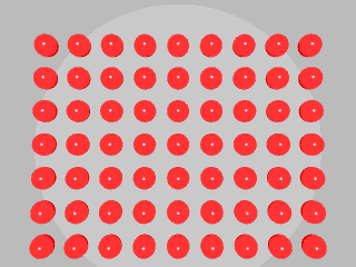
The picture above shows a set of billiard balls where the artist’s eye is directly above the central one. Notice how the balls at the end of the central horizontal and vertical rows get progressively elongated as ellipses the farther they are from the centre. The ones at the farthest corners are the most distorted.
Like all perspective pictures, this distortion is truly anamorphic. If you move your eye closer to the screen keeping it above the central ball you will see that the other balls become more realistically round.
Since this picture is small, unless you are very short sighted you may not be able to focus on the screen when you are at the best position. There is a higher resolution version of the picture for you to download and print out in the downloads post.

The painting above is in the Vatican in Rome. It is one of a series of murals on the walls of a room called the Stanza della Segnatura (the room for signing important documents). It was painted in 1510-11. It is appropriate here because it is about Plato’s academy in ancient Greece with its importance of mathematics, especially geometry and its relationship with music in the culture of the time.
Many of the people in the picture are supposed to be famous mathematicians. Some of the people who represent them are prominent people of the time, including Leonardo da Vinci who traditionally is supposed to be Plato (in the arch in the centre) and Raphael has even included himself.
The central vanishing point is the face of Plato. The building and floor is drawn in perspective as the vanishing points show. Even the object in the centre is drawn in the same perspective since its sides extended (shown in red) meet on the (blue) horizon line.

Look at the close up of the right hand corner above Raphael has pictured a person holding a sphere. Note how the spheres are represented as a circle even though it they at the edge of the painting.
So how has Raphael made the rest of the picture seem natural without the anamorphic distortion inherent in such a large picture? Well, he has painted the people in the front and to the edge with their own perspective, that is Raphael has changed his viewing position . So the people holding the spheres in the excerpt from the picture look in correct perspective.
If you go to the Vatican, Plato’s head is way above yours as you walk on the floor, so you can never position your eye in the correct position for the artist’s viewpoint for the main perspective of the building. Yet the picture works, because the people each have their own viewpoint.
Pirenne in his book on the optics of paintings and photographs, says that the nineteenth century perspectivist La Gournerie took an engraved version of the picture and stuck the correct perspective ellipses over the ones in the painting. They did not look acceptable as spherical objects, whereas Raphael’s circles do.
How to look at a picture without seeing distortion
Where a picture is painted in true perspective, that is as if it were being looked at through a window, it is anamorphic to a greater or lesser extent. Only by looking from the same position as the artist, can all distortion be removed.It is possible to work out where the artist’s viewpoint would have been, given certain assumptions that can usually be made. If you look in this way then the perspective picture becomes distortion free. Stray from this point and parts of the picture become distorted. Artists have ways of compensating for this in pictures and this is discussed in the section “So how do artists paint spheres” below.
How do you find the artist’s viewpoint?
If you have a painting in perspective, which has some objects whose perspective properties you can use, then you can reconstruct the artist’s viewpoint. It is also possible to do much more, but that is out of the scope of these pages.The easiest type of painting to work with, is one which has a set of square tiles or other such objects which are on a flat plane such as the ground. This painting of The Annunciation by the Italian Carlo Crivelli which dates from 1486 is a typical example.

The actual painting is 2070 mm high by 1465 mm across. The base of the picture is displayed 1060 mm off the floor. To find the viewing point on the actual painting, we need to work with a reproduction and then scale it up to the size of the actual painting.
The steps to find the artist’s viewing position are:
1. Draw in some lines of the painting which are parallel (in the space of the painting) to a line perpendicular to the viewer. These are the yellow lines.
2. Intersect these lines at the central vanishing point.
3. Draw a horizon line (red) through this line.
4. Draw a line (blue) which is the diagonal of a square and intersect the horizon line in the right diagonal vanishing point.
5. Measure the distance from the central vanishing point to the right diagonal vanishing point.
Since the central vanishing point is directly in front of the artist’s eye, we need to place our eye directly in front of the grid behind the archway. Now we need to find out how far away we need to be. This is the distance from the central vanishing point to the right diagonal vanishing point as measured in step 5. Why this is so is described below.
Using proportion on a measurement on the lines drawn and the actual size of the painting, then the result is that we need to be about 120 cm away from a picture at a height of about 200 cm above the floor the way the picture is hung.
Now an average person’s eyes are about 160 cm above the ground. This means that if you want to get the true or best view of the painting, you need to do so standing on a box 40 cm high (about 16 inches). Moreover, if you try to look at parts of the painting, like the peacock at the top right, it looks distorted.
Why not see if you can find some perspective pictures in a gallery. Buy a postcard and work out the artist’s viewing position. Is it possible to place your eye in the correct position when you go back to the gallery?
How to find out the distance of the viewing point
All lines in the same plane that point in the same direction, end at the same vanishing point in the picture, so we only need to consider one line. This is a view from above with C as the central vanishing point and R the right diagonal vanishing point. That is, R is the point where all diagonals of squares meet in the picture if they have a side parallel to the picture plane, like this:
So we only need to consider the one square shown here where E is the eye point.
Since angle CER is 45 degrees and angle ECR is a right angle, then the triangle ECR is isosceles with ER is the same length as CR. So if we find ER as was done with Crivelli’s Annunciation, then we know the distance of the eye in front of picture (EC).
The mystery of pictures hung in galleries
All this has been known for over five hundred years, but many galleries do not seem to take heed of it when hanging perspective paintings. They have problems of space in many instances, but more often than not the picture becomes anamorphically distorted to an extent that it is not possible to see it correctly. In many cases the pictures do not really come alive.In some cases the problem may be that curators are not interested in looking. I have seen cylindrical mirror anamorphic pictures displayed flat on the wall, with no chance for you to see how the picture was intended to be viewed, or for you to know what it represents. It is just a very abstract looking picture. There was not even a photograph to show what happens.
Foreshortening and visual illusions
Your brain knows all about foreshortening and uses it to estimate distances and make sense of three dimensional space. Take a close look at the following picture.
If you physically measure the red, blue, and yellow topped cylinders you will find that they are all the same size. However, if you look at it as a perspective picture, especially comparing the cylinders to the foreshortening of the lines, then the blue looks bigger than the red and the yellow bigger than the blue.
Spheres and distortion in paintings
If a painting is created in true perspective, then as you get closer to the edge of the painting distortion increases. You will not see this if you look from the same position as the artist’s eye. But paintings are not normally viewed that way, especially if they are a mural on a large wall. After all, even if someone wanted to get the perfect view, they would have to move towards the painting and could still be looking at it as they did so. Consequently, they would see distortions. If you look at the development of paintings in the century or so after perspective was discovered (say 1430 to 1550) then you will see that artists followed the rules strictly as they learnt about them, but then began to bend them.Piero della Francesca and Leonardo da Vinci were among the first to point out that distortion occurs at the edge of paintings. The effect is particularly marked where you have two types of objects, spheres and columns. Leonardo used an example like the following to show the effect. This is logically puzzling at first, since objects which are farther away are larger on the picture instead of smaller as foreshortening would have us believe.
This diagram below shows the cross section of an artist’s view from above of a set of circular columns. The artist’s eye is where the vertical lines meet and the horizontal line corresponds to the picture plane. The coloured circles are the cross sections of a set of columns.

Notice how the red column is directly in front of the artist, but the blue one is quite a way off. Compare the representation of the columns in the picture (the grey lines on the picture plane). Notice how much longer the blue line is than the red one; in fact it is over 50% longer despite the fact that the blue column is farther away from the artist.
As a consequence of Leonardo studying this problem, he came up with a rule of thumb for how you should paint a picture. He said that the angle from the perpendicular to the picture plane and the line to the farthest edge of the painting should be no more than 30 degrees.
Investigation: Plot the length of the line on the picture as the column moves away from the artist. This is a good exercise to do in a spreadsheet. There are a number of parameters that can vary:
- the size of the column
- the distance of the artist from the picture plane
- the distance of the row of columns behind the picture plane.
Drawing spheres in paintings
Spheres suffer from the same type of distortion when painted in perspective. If the line joining the artist’s eye to the centre of a sphere is perpendicular to the picture plane, then the sphere will appear to be a circle. The spheres do not have to be far away from the centre of the picture before their shape becomes obviously not circular.
The picture above shows a set of billiard balls where the artist’s eye is directly above the central one. Notice how the balls at the end of the central horizontal and vertical rows get progressively elongated as ellipses the farther they are from the centre. The ones at the farthest corners are the most distorted.
Like all perspective pictures, this distortion is truly anamorphic. If you move your eye closer to the screen keeping it above the central ball you will see that the other balls become more realistically round.
Since this picture is small, unless you are very short sighted you may not be able to focus on the screen when you are at the best position. There is a higher resolution version of the picture for you to download and print out in the downloads post.
So how do artists paint spheres
Firstly, artists normally do not paint spheres at the edge of paintings in perspective, although there is an example below. They simply paint a circle since most people move about when looking at a painting, unless it is a small one. In the latter case the angle subtended by the picture is small, so the distortion does not arise. The following case of Raphael’s The School of Athens is a case where there could be a problem, but he skilfully overcame it by bending the rules of perspective.
The painting above is in the Vatican in Rome. It is one of a series of murals on the walls of a room called the Stanza della Segnatura (the room for signing important documents). It was painted in 1510-11. It is appropriate here because it is about Plato’s academy in ancient Greece with its importance of mathematics, especially geometry and its relationship with music in the culture of the time.
Many of the people in the picture are supposed to be famous mathematicians. Some of the people who represent them are prominent people of the time, including Leonardo da Vinci who traditionally is supposed to be Plato (in the arch in the centre) and Raphael has even included himself.
The central vanishing point is the face of Plato. The building and floor is drawn in perspective as the vanishing points show. Even the object in the centre is drawn in the same perspective since its sides extended (shown in red) meet on the (blue) horizon line.

Look at the close up of the right hand corner above Raphael has pictured a person holding a sphere. Note how the spheres are represented as a circle even though it they at the edge of the painting.
So how has Raphael made the rest of the picture seem natural without the anamorphic distortion inherent in such a large picture? Well, he has painted the people in the front and to the edge with their own perspective, that is Raphael has changed his viewing position . So the people holding the spheres in the excerpt from the picture look in correct perspective.
If you go to the Vatican, Plato’s head is way above yours as you walk on the floor, so you can never position your eye in the correct position for the artist’s viewpoint for the main perspective of the building. Yet the picture works, because the people each have their own viewpoint.
Pirenne in his book on the optics of paintings and photographs, says that the nineteenth century perspectivist La Gournerie took an engraved version of the picture and stuck the correct perspective ellipses over the ones in the painting. They did not look acceptable as spherical objects, whereas Raphael’s circles do.
.
Samuel Marolois used this method to draw an image of a dog in 1614 which was by then “the old-fashioned anamorphic method”. It does not matter which side of the screen you view from to restore the image. Neither works perfectly, because the stretching is not true anamorphosis. Note how he used a grid to help him create the drawing and how the grid is rectangular and equally spaced in the anamorphic version.
 Words
can be stretched very easily using graphics programs. Vector programs
like Corel Draw or Adobe Illustrator allow you to do this very easily.
If you use a pixel paint program, then resize the image. You need to
stretch at least 1000% to get words that are impossible to read without
looking from the end. They work better if you stretch along the vertical
axis of the words, as here. (Turn your head and look along the screen.)
 To see why these images are not true perspective anamorphoses, see the description of foreshortening.


This is not a perspective anamorphosis, but because the image is only cut and not stretched, it appears as good as new when viewed from the correct position. You do not have to use a mirror, but Vignola has used one to add to the magic. If you were to look and see the image in the mirror, you would only see the blank sides of the blocks and it would not be clear where the picture came from.
The use of stretching
If a grid is stretched, the spacing remains equal. See foreshortening to see how a grid behaves in a true perspective way. But in many cases this does not matter. It is very easy to see what the original image should be. This is the way road markings are made anamorphic.Samuel Marolois used this method to draw an image of a dog in 1614 which was by then “the old-fashioned anamorphic method”. It does not matter which side of the screen you view from to restore the image. Neither works perfectly, because the stretching is not true anamorphosis. Note how he used a grid to help him create the drawing and how the grid is rectangular and equally spaced in the anamorphic version.
 Words
can be stretched very easily using graphics programs. Vector programs
like Corel Draw or Adobe Illustrator allow you to do this very easily.
If you use a pixel paint program, then resize the image. You need to
stretch at least 1000% to get words that are impossible to read without
looking from the end. They work better if you stretch along the vertical
axis of the words, as here. (Turn your head and look along the screen.)
 To see why these images are not true perspective anamorphoses, see the description of foreshortening.
Vignola’s method
Giacomo Barrozzi da Vignola wrote a book on perspective published in Rome in 1583 which include some perspective tricks. One of them was to take a picture and cut it into a set of strips. Pasting this onto a set of triangular cross-sectioned blocks of wood allowed the image to be recreated when viewed in a mirror.

This is not a perspective anamorphosis, but because the image is only cut and not stretched, it appears as good as new when viewed from the correct position. You do not have to use a mirror, but Vignola has used one to add to the magic. If you were to look and see the image in the mirror, you would only see the blank sides of the blocks and it would not be clear where the picture came from.
Making your own Vignola anamorphosis
Take a picture and cut it into a series of equal strips say an inch or 2.5 cm wide. Mark a series of lines on another piece of paper as if you were going to cut out the same width strips. Stick the strips of the cut-out picture in every other position. Fold up the paper along the edges of the strips to make a concertina. With the paper pushed together so that it looks like Vignola’s, look at the image in a mirror as he does or look at it obliquely.Plane Anamorphosis
Creating an anamorphic picture on a plane is very similar to
drawing normally in perspective. The only difference is that the picture
plane (the window in the description of perspective) is not
perpendicular to the artist’s line of site.
This is how Jean Francois Niceron (who wrote the most comprehensive books on how to draw anamorphic pictures in the seventeenth century) showed how to create a plane anamorphosis.

The two pictures in the centre are the images to be made anamorphic using the grid method. You need to look from the right side of the picture to see them restored.
The geometry of the grid is as follows:

You should be able to see similarities in the construction for a perspective grid described in the explanation of perspective. You should also be able to relate to Niceron’s picture above. The anamorphic effect is to look at the image on the picture plane and have it appear to be a square grid, as if the square grid were placed in the position AB.
The original grid is shown at the bottom left. The blue and red lines at the bottom of the diagram are a plan view (looking from above) to explain the geometry. In this plan view the eye views the grid (which is seen as a red line), and the vertical lines of the grid are projected on the picture plane, which is the blue line through B and N. The line through the centre of the red line from E is perpendicular to AB, and EN is also perpendicular to this line.
To create the anamorphic grid. This description relates the plan and the view on the picture. In practice you only have to draw the lines Niceron used, so a shortened version is described below:
1. Choose a point D above N. Construct NC, so that CD equals EN.
2. Draw perpendiculars above the projected ends of the grid, that is B and W, and then for each projection from the blue line WN.
3. Join C to where the perpendicular line corresponding to the central line of the grid meets the horizontal blue line through D.
4. Extend this line to find point T and find R the point symmetrically above the blue horizontal line through D.
5. The line drawn in step 5 also finds the position of point S, and point U is found symmetrically.
6. RSTU form the outside of the grid and the vertical perpendiculars locate one set of the lines of the grid.
7. To find the equivalent of the horizontal set, join D to where the line CST meets each of the vertical lines.
To see the grid in the correct perspective, look from the right at a point E which is in front of the plane of the image. Niceron and others did not bother with this, but only used a simplified construction.
1. Choose a point D with a horizontal line through it.
2. Choose C above the point D at a distance equal to the distance in front of the paper from which to view the completed image.
3. Draw a line RT perpendicular to the blue horizontal line, so that R and T are symmetrically placed.
4. Join C and T and D to R and T. CT cuts DR at S and U can be found symmetrically from the position of S, or alternatively by erecting a perpendicular to the blue line from S.
5. Divide RT into equal divisions to match the number of points in the vertical direction in the grid.
6. Join these points to D to give the equivalent of the horizontal set of lines of the grid.
7. To find the vertical set, draw vertical lines (perpendicular to the horizontal blue line) where the line CST meets each of the lines.
The shape of the image is always like this:

This means if you have an image like the portrait of Edward VI by William Scrots which is in the National Portrait Gallery in London, and you see the widest and most stretched part at the left, then you must look from the right.

In fact if you look closely at the frame on the right of the picture, then you can see a gap through which you need to look to see the portrait restored. An almost complete photographic restoration looks like this:
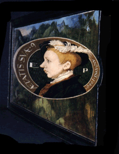
Many books show this incorrectly restored version. The only one I know that has it correct, is John North’s “The Ambassador’s Secret”. The following is a restoration with good circles.


Go away from it, and the image starts to appear the way the artist originally saw it.
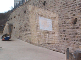
In the above view, at the bottom right hand corner you can see a seat. Sit on the seat and you can see that the true image is a door:


These are images painted on cones by John Sharp.
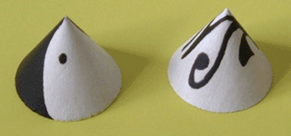
This is what you see if you look at the first cone painting from the side.

When you look directly above the tip of the cone, you see the Yin-Yang symbol

These two pictures show what you see if you look at the second cone painting from the side.

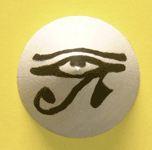
When you look directly above the tip of the cone, you see the eye of Horus.
Now, it is difficult to draw onto a cone, but we can make a cone from a sector of a circle by rolling it up. The problem is now to draw on this sector. Although this sounds complicated, geometrically, this is the easiest method for making anamorphic images. In the following descriptions, all references to cones are to right circular cones, that is cones formed from a circle with their apex a point perpendicularly above the centre. To paint on these wooden cones, the image was created on a sector and this was then traced onto the wood using carbon paper.
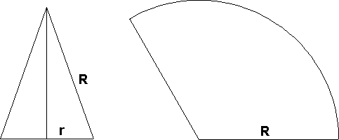
In the following description the image is going to be placed on the inside surface of the cone.
Step 1 – Draw a circle around the picture or radius r and decide on an angle for the sector (e.g. 120° as here to give a factor of 1/3 for n), calculate the radius of the sector (R = r/n) and then construct the triangular cross section of the cone (CB = R and DB = r). Place the drawing inside the circle.

Step 2 – Decide on where the eye will be positioned along the axis of the cone at point E.
Step 3 – Choose a point P on the drawing. This point will become point Q on the sector which forms the cone. Imagine that the triangular cross-section is rotated until it lies along line DP. Then point P is on the radius DB as shown on the right. Join E and P and extend the line to intersect the side BC at point Q. We now know how far point Q is from the centre of the sector in the figure below.
Step 4 – To find the position of Q, on the sector below, draw an arc of a circle radius a (equal; to CQ above) and then measure the angle q in the base circle. Draw an angle which is /3 at the centre of the sector and intersect the arc to find the position of Q. It has to be a factor of 1/3 since a 360° rotation has to be compressed into the 120° sector.

Step 5 – Repeat for all points in the image.

The grid is interesting in its own right. Print the grid sector on the downloads page and make it into a cone. When you make it do not bend the tab, just put some glue on it and fit the edge of the tab to the other edge of the sector. This grid is for an image which you see at by looking into the cone.
There is another image on the post which shows a grid meant to be looked at on the outside of the cone like the following picture.

Look along the axis of the cone and you will see a square grid. As you move your eye along the axis of the cone, there will be one place (about three times the height of the cone from the base) where the grid is perfect.
Note that all the lines are curved on the sector. Each curved line corresponds to a line on the grid which was the starting point on the base of the cone. Each line of the base grid defines a plane together with the eye position. This plane cuts the cone in a curve called a conic section. There are three types of conic section: ellipses, hyperbolae and parabolae. Which one you get when you cut a cone depends on the position of the plane. In these cases they are hyperbolae. Corresponding points on centres of the sides in the “outside” version are much closer to the centre.
* A normal 11 by 11 grid to use as a master to create your drawings.
* An “outside” sector grid where you need to make sure the image appears on the outside of the cone.
* An “inside” sector grid where you need to make sure the image appears on the inside of the cone.
* These are available in PDF format.
Use copies of the normal grid and colour them in to make pictures like the example and then transfer your picture to a copy of the sector and make it into a cone to create your own anamorphic artwork.
This is how Jean Francois Niceron (who wrote the most comprehensive books on how to draw anamorphic pictures in the seventeenth century) showed how to create a plane anamorphosis.

The two pictures in the centre are the images to be made anamorphic using the grid method. You need to look from the right side of the picture to see them restored.
The geometry of the grid is as follows:

You should be able to see similarities in the construction for a perspective grid described in the explanation of perspective. You should also be able to relate to Niceron’s picture above. The anamorphic effect is to look at the image on the picture plane and have it appear to be a square grid, as if the square grid were placed in the position AB.
The original grid is shown at the bottom left. The blue and red lines at the bottom of the diagram are a plan view (looking from above) to explain the geometry. In this plan view the eye views the grid (which is seen as a red line), and the vertical lines of the grid are projected on the picture plane, which is the blue line through B and N. The line through the centre of the red line from E is perpendicular to AB, and EN is also perpendicular to this line.
To create the anamorphic grid. This description relates the plan and the view on the picture. In practice you only have to draw the lines Niceron used, so a shortened version is described below:
1. Choose a point D above N. Construct NC, so that CD equals EN.
2. Draw perpendiculars above the projected ends of the grid, that is B and W, and then for each projection from the blue line WN.
3. Join C to where the perpendicular line corresponding to the central line of the grid meets the horizontal blue line through D.
4. Extend this line to find point T and find R the point symmetrically above the blue horizontal line through D.
5. The line drawn in step 5 also finds the position of point S, and point U is found symmetrically.
6. RSTU form the outside of the grid and the vertical perpendiculars locate one set of the lines of the grid.
7. To find the equivalent of the horizontal set, join D to where the line CST meets each of the vertical lines.
To see the grid in the correct perspective, look from the right at a point E which is in front of the plane of the image. Niceron and others did not bother with this, but only used a simplified construction.
1. Choose a point D with a horizontal line through it.
2. Choose C above the point D at a distance equal to the distance in front of the paper from which to view the completed image.
3. Draw a line RT perpendicular to the blue horizontal line, so that R and T are symmetrically placed.
4. Join C and T and D to R and T. CT cuts DR at S and U can be found symmetrically from the position of S, or alternatively by erecting a perpendicular to the blue line from S.
5. Divide RT into equal divisions to match the number of points in the vertical direction in the grid.
6. Join these points to D to give the equivalent of the horizontal set of lines of the grid.
7. To find the vertical set, draw vertical lines (perpendicular to the horizontal blue line) where the line CST meets each of the lines.
Comparison with a perspective foreshortening
In a normal perspective picture the foreshortening means that the lines of the grid appear closer together the farther away the lines of the grid are to the viewer. In a plane anamorphic grid, the lines are equally spaced on the real grid but appear closer together on the part of the image nearest to the viewing point.The shape of the image is always like this:

This means if you have an image like the portrait of Edward VI by William Scrots which is in the National Portrait Gallery in London, and you see the widest and most stretched part at the left, then you must look from the right.

In fact if you look closely at the frame on the right of the picture, then you can see a gap through which you need to look to see the portrait restored. An almost complete photographic restoration looks like this:

Many books show this incorrectly restored version. The only one I know that has it correct, is John North’s “The Ambassador’s Secret”. The following is a restoration with good circles.

The Passing Through Project
The artists Colin Wilbourn and Karl Fisher have created some public anamorphic art in the north east of England. The Passing Through sculpture (1997) is at St Peter’s Riverside in Sunderland. This is a plane anamorphosis. When you walk past it, the sculpture looks like an odd shape on the wall.
Go away from it, and the image starts to appear the way the artist originally saw it.

In the above view, at the bottom right hand corner you can see a seat. Sit on the seat and you can see that the true image is a door:

Holbein’s The Ambassadors
Perhaps the most famous painting with a hidden plane anamorphic object in it is the painting called The Ambassadors by Hans Holbein in the National Gallery in London.
Putting an image into Cone
For those who do know how to look at the painting, it has been described as all manner of puzzling objects from a banana to some sort of fish. If you look from the right hand edge of the painting, then you see it is a skull.Imagine an image on the base of a right circular cone. We want to transfer the image onto the slanted face of the cone so that when we look from the correct point, the image appears as it was originally drawn. The two cases of the image being on the inside and outside surface give the same result when viewed, but the images look different when drawn.These are images painted on cones by John Sharp.

This is what you see if you look at the first cone painting from the side.

When you look directly above the tip of the cone, you see the Yin-Yang symbol

These two pictures show what you see if you look at the second cone painting from the side.

When you look directly above the tip of the cone, you see the eye of Horus.

Now, it is difficult to draw onto a cone, but we can make a cone from a sector of a circle by rolling it up. The problem is now to draw on this sector. Although this sounds complicated, geometrically, this is the easiest method for making anamorphic images. In the following descriptions, all references to cones are to right circular cones, that is cones formed from a circle with their apex a point perpendicularly above the centre. To paint on these wooden cones, the image was created on a sector and this was then traced onto the wood using carbon paper.
Making a cone
If a cone is sliced in half perpendicularly to the base, the cross section is a triangle. Suppose we start with a sector of a circle whose angle is a fraction n of 2. Suppose it has a radius R and that the radius of the base of the cone is r. The arc length of the sector 2R is equal to the circumference of the circle at the base of the cone (2r), so r = nR. In the examples shown here the sector angle is 120°, so n is 1/3. Knowing these two radii, it is easy to construct the triangular cross section.
In the following description the image is going to be placed on the inside surface of the cone.
Step 1 – Draw a circle around the picture or radius r and decide on an angle for the sector (e.g. 120° as here to give a factor of 1/3 for n), calculate the radius of the sector (R = r/n) and then construct the triangular cross section of the cone (CB = R and DB = r). Place the drawing inside the circle.

Step 2 – Decide on where the eye will be positioned along the axis of the cone at point E.
Step 3 – Choose a point P on the drawing. This point will become point Q on the sector which forms the cone. Imagine that the triangular cross-section is rotated until it lies along line DP. Then point P is on the radius DB as shown on the right. Join E and P and extend the line to intersect the side BC at point Q. We now know how far point Q is from the centre of the sector in the figure below.
Step 4 – To find the position of Q, on the sector below, draw an arc of a circle radius a (equal; to CQ above) and then measure the angle q in the base circle. Draw an angle which is /3 at the centre of the sector and intersect the arc to find the position of Q. It has to be a factor of 1/3 since a 360° rotation has to be compressed into the 120° sector.

Step 5 – Repeat for all points in the image.
Using a grid to speed up drawing
To transfer the picture on the base of the cone point by point to the sector is quite time consuming, but the steps are easy to follow. An easier way is the grid method the artist in Dürer’s woodcut is using, so a grid has been provided on the post. The result is as follows:
The grid is interesting in its own right. Print the grid sector on the downloads page and make it into a cone. When you make it do not bend the tab, just put some glue on it and fit the edge of the tab to the other edge of the sector. This grid is for an image which you see at by looking into the cone.
There is another image on the post which shows a grid meant to be looked at on the outside of the cone like the following picture.

Look along the axis of the cone and you will see a square grid. As you move your eye along the axis of the cone, there will be one place (about three times the height of the cone from the base) where the grid is perfect.
Note that all the lines are curved on the sector. Each curved line corresponds to a line on the grid which was the starting point on the base of the cone. Each line of the base grid defines a plane together with the eye position. This plane cuts the cone in a curve called a conic section. There are three types of conic section: ellipses, hyperbolae and parabolae. Which one you get when you cut a cone depends on the position of the plane. In these cases they are hyperbolae. Corresponding points on centres of the sides in the “outside” version are much closer to the centre.
Making your own anamorphic images from the grids
* A normal 11 by 11 grid to use as a master to create your drawings.
* An “outside” sector grid where you need to make sure the image appears on the outside of the cone.
* An “inside” sector grid where you need to make sure the image appears on the inside of the cone.
* These are available in PDF format.
Use copies of the normal grid and colour them in to make pictures like the example and then transfer your picture to a copy of the sector and make it into a cone to create your own anamorphic artwork.
Putting an image into cylinder
Cylinders with images on them are quite common objects, but the image is usually such that you have to turn the cylinder round or move around it in order to see it. A flat image is simply wrapped around the cylinder. It is quite easy to put an image onto a cylinder so that if you look from the side you see the image as if you were looking onto an image as if it were on a plane.Now, it is much easier to draw on a flat surface and roll the surface onto a cylinder. Since a soft drinks can is a standard size surface most of the following use that size to create the images. As with other anamorphic images, they are easier to draw using the grid method.
The basic geometry
This is a simplified method using a less complicated type of projection. It is called parallel projection and is as if the eye is an infinite way off so that all lines joining original points and their corresponding ones in the image form a set of parallel lines. It simplifies the geometry since distortion only occurs around the cylinder and not along the direction of the cylinder axis.Anamorphic images for viewing from a definite eye point can be made, but working out distortions in two directions is complicated. In the diagrams, each is a view from above, with the viewer looking from the left.
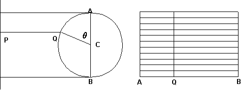 In
the left diagram a point P lies on the picture which is the vertical
line on the left. It is transferred to the cylinder at point Q, simply
by drawing a line parallel to the direction of view. We want to draw a
piece of paper which is wrapped around the cylinder, to fit over the arc
AQB. In the unrolled anamorphic drawing as shown at the above right,
the vertical spacing of lines remains equal. A vertical line which
results as point Q appears at the position shown.
In
the left diagram a point P lies on the picture which is the vertical
line on the left. It is transferred to the cylinder at point Q, simply
by drawing a line parallel to the direction of view. We want to draw a
piece of paper which is wrapped around the cylinder, to fit over the arc
AQB. In the unrolled anamorphic drawing as shown at the above right,
the vertical spacing of lines remains equal. A vertical line which
results as point Q appears at the position shown.If the radius of the cylinder is r, then the arc length is r. Thus the resultant image is /2 times as wide as the original one when we unroll it. To find the position of Q on the resultant image we need to measure the angle and in the unrolled anamorphic drawing as shown at the above right, the distance AQ = AB/180 (if is measured in degrees). The results for an equally spaced square grid look like this:
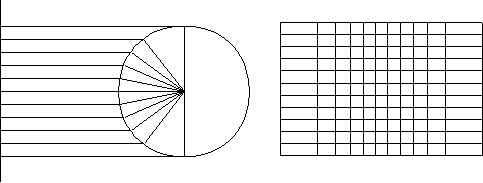
Note how the lines are wider at the ends than they are in the middle. The reason for this is obvious in the projection diagram at the left.
Look at the picture below. The Maths Year 2000 logo has been made into an anamorphic image as above. However, it does not look too distorted until you look closely at it.
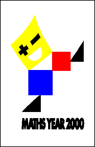
Note how the square for the head has lines which are curved, but the other squares are straight-sides because they are parallel to the sides of the box. They are, however, no longer squares.
Andrea Pozzo and the ceiling of St. Ignazio in Rome
In the seventeenth century as mathematics advanced quickly, so did the study of perspective and this century was possibly the heyday of anamorphic art. One of the foremost artists was the Jesuit Andrea Pozzo. His most impressive work is in the Church of St Ignatius in Rome. (Ignatius Loyola was the founder of the Jesuits.) It took nearly ten years to complete from 1685-1694. This picture cannot hope to give more than an impression of the amazing work of art. It can only be experienced by being in the church.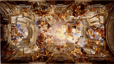
The ceiling of the church is a huge vaulted half cylinder. The huge painting is an anamorphic representation of St Ignatius Loyola entering heaven. If you stand in the centre of the nave on the spot marked with a star, then you see the painting in its full glory. But if you move towards the door or the altar, then the columns appear to fall on top of you. Apart from being a superb piece of art, it must rank as the world’s best anamorphic painting.
Pozzo describes how he made the painting in his book on architecture, which is available as a facsimile edition. He used a grid of string placed across the plane of the cross section of the half cylinder. He then attached a thread above the viewpoint on the ground and stretched it way up into the vault. Helped by a light under the fixing point to cast shadows of the grid, he drew the grid on the ceiling. He then used the grid in conjunction with detailed perspective drawings to create the painting.
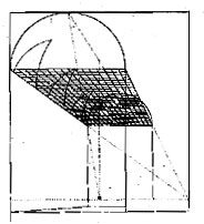
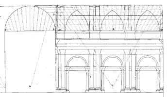
This is a view of the ceiling, showing the half-cylinder shape:
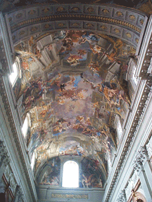
But this is not the only anamorphic marvel in St Ignatius Church. For various reasons, including the fact that to build one would have blocked out the light to surrounding buildings, there is no cupola in the church. Instead, Pozzo painted one. He did this before painting the vault and it was his skill in producing a realistic representation of one that got him the commission to paint the vault. If you did not know it was a painting and just glanced up, you would think it was a real architectural object. Not only is the light and shadow realistic, but the viewing position is not that critical.

Anamorphic art at Vauxhall
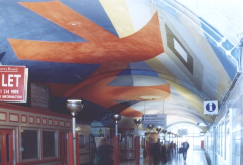
The Vauxhall Rail (not the underground) station in London, has an the entrance hall which is is a tunnel with a curved ceiling that used to have a series of anamorphic paintings on it. These were made by the artist William Pye. He drew the images on the ceiling by using a powerful slide projector. Unfortunately, Network Rail painted over them. Unless you stood and looked at just the right place (markers were on the floor), it is hard to make out what they were.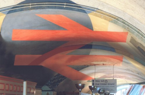
But if you are not in th ecorrect place, it looks like this:
Advetises: Shop Here
http://www.ebay.in/
http://www.ebay.co.uk/
http://www.ebay.com/
http://www.ebay.de/ http://www.ebay.fr/ http://www.ebay.com.my/
Electronics, Cars, Fashion, Collectibles, Coupons and More Online Shopping | eBay
www.ebay.com
No comments:
Post a Comment